The problem
Most Choco customers ordered on mobile, so the web app had received little attention. Restaurant groups with many locations felt this most. Although they made up only about 5% of users, each of them ran many locations, and their order volume and complexity were disproportionately higher than those of a single restaurant.
Their biggest pain point was the order guide, the list of products each location orders from. Chains could edit only one location at a time, and few managed even that. As a result, our operations team handled almost every change by hand, location by location, every day and, for some chains, several times a day. As the chains grew, this approach stopped scaling, both for them and for us. In interviews, purchasing managers described it this way:
“I have to go store by store. We're growing, and it's becoming impossible.”
Reframing the problem
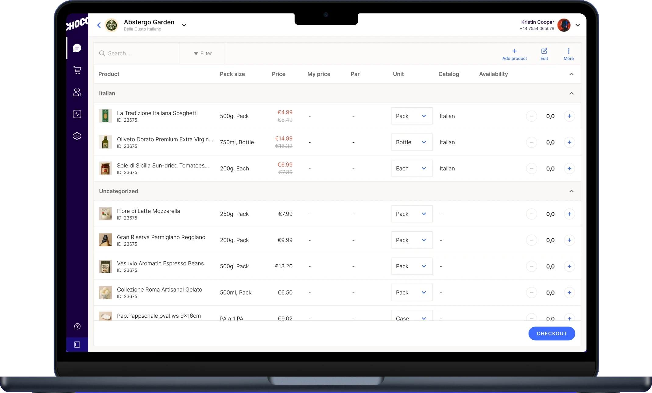
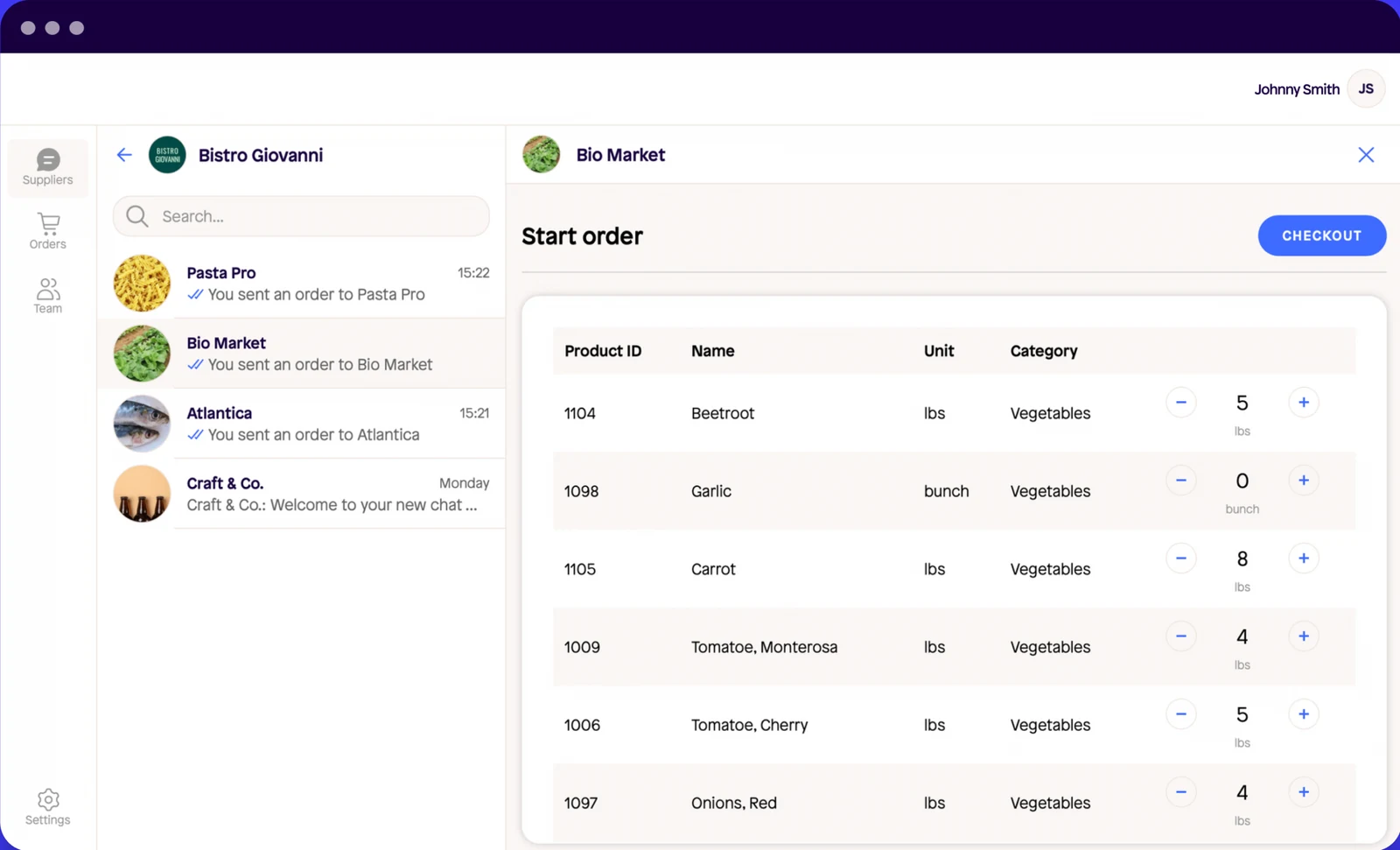
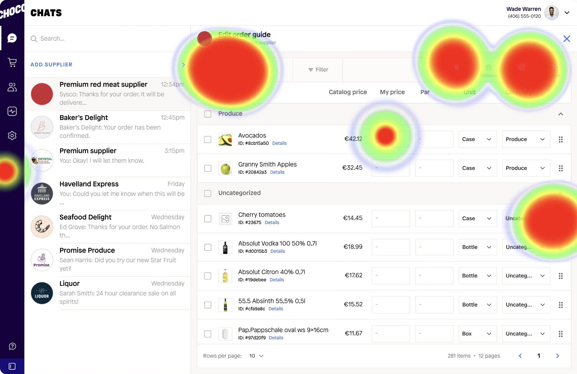
The project started with a request from Smith Louis, our PM: let restaurant groups with multiple locations manage their order guides on web, across all locations at once. Web only had basic editing, adding or removing a product through the catalog. Reorganizing, categories and changes across locations did not exist. My audit of the web app showed that ordering needed attention too. The supplier chat took up half the screen and could not be collapsed, so people opened their order guide inside a cramped space. Product names were cut off, there were no images, and there was no search, sorting or filtering. Availability, lead time and cutoff time were missing altogether.
The new table we were building for editing could carry ordering as well, so I proposed to Smith that we fix both in the same project, at an estimated cost of one to two extra weeks. He agreed. In the end, the work took one extra week, extending the first release from four to five weeks. Order mode shipped in July, and Edit mode followed in November after further design and testing.
Take a look at the old ordering screen. Hover over or tap a number to see each problem.
Goals
One goal came with the original brief, and I added a second one after the audit.
Original goal: chains edit order guides themselves. Chains should be able to update all locations at once, without involving our operations team. Measured by the number of change requests sent to operations.
Added after the audit: ordering on web works for chains. Because both flows ran on the same table, fixing one meant fixing the other. Measured by conversion from starting an order to placing it.
Constraint for the first release: five weeks, using existing components.
Research
Where chains got stuck. Chains used the web app for inventory and integrations, but dropped off at ordering. Editing barely worked, since changes applied to one location at a time: of 842 web sessions over 90 days, only 32 ended with an updated order guide.
What they asked for. In Intercom and Canny, the most frequent request was consistent: let us edit our own order guides, for all locations at once.
Why. My own interviews, those of other designers and our Dovetail library all pointed to availability. A supplier that is out of pallets may still sell cases or single bottles, and buyers needed to see this while ordering.
What matters most. To close the research, Smith and I ran a card sort of 25 product attributes. Availability, lead time and cutoff time ranked highest, while price came fourth.
Every finding pointed to the same conclusion: buyers care less about price than about when their products will arrive. Kitchens work within a budget, but running out of stock costs them service.
“I don't care about any product details unless I know if it's available and when I can get it.”
Aleks, Purchasing Manager at Haferkater, Berlin
Three directions
Before designing the final screen, I sketched three directions for the ordering table and reviewed them with engineering, weighing how quickly each could ship against how much it would help buyers. Hover over or tap one to compare.
 01Keep the layout
Fast to ship, but keeps the cramped screen and the missing information.
 02 · ChosenExtend the table
Fixes the screen with table components we already had.
 03Visual catalog
A bigger visual jump, but it needs custom components and far more engineering time.
User testing
I tested two of the directions against each other in Maze: keeping the current layout and extending the table. On the order guide screen, the extended table performed clearly better, with average time on screen dropping from 9.4s to 1.3s and misclicks from 33% to 0%. These figures apply to the order guide screen only. Other steps in the same test still revealed issues: people took wrong paths, misclicked when choosing a location, and found the label "Share" misleading. We resolved all three before handoff.
I also tested the editing flow with 41 participants. Moving a product into a category proved easy, with a 97% success rate in 8 seconds. Creating a category was harder, at 83% and 55 seconds, and participants expected to be able to drag categories and move many products at once. Edit mode therefore received both capabilities, designed specifically for the web rather than copied from mobile.
A second test with 30 participants focused on changes across locations. Adding a promotion to one location's guide succeeded 93% of the time, adding it to all locations 79%, finding an error 73%, and removing products from every location 92%.
Switch between the two versions to compare.
Solution
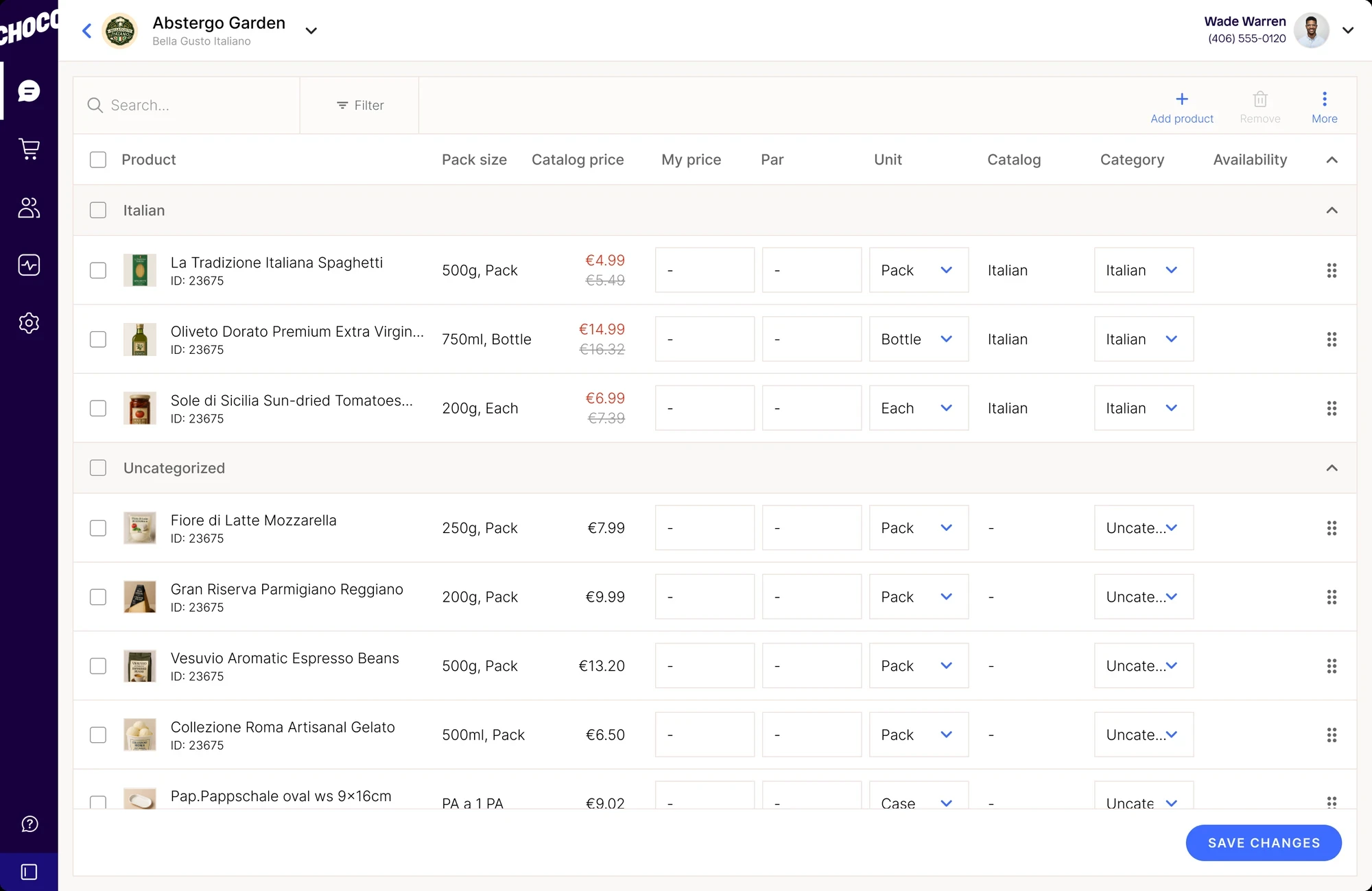
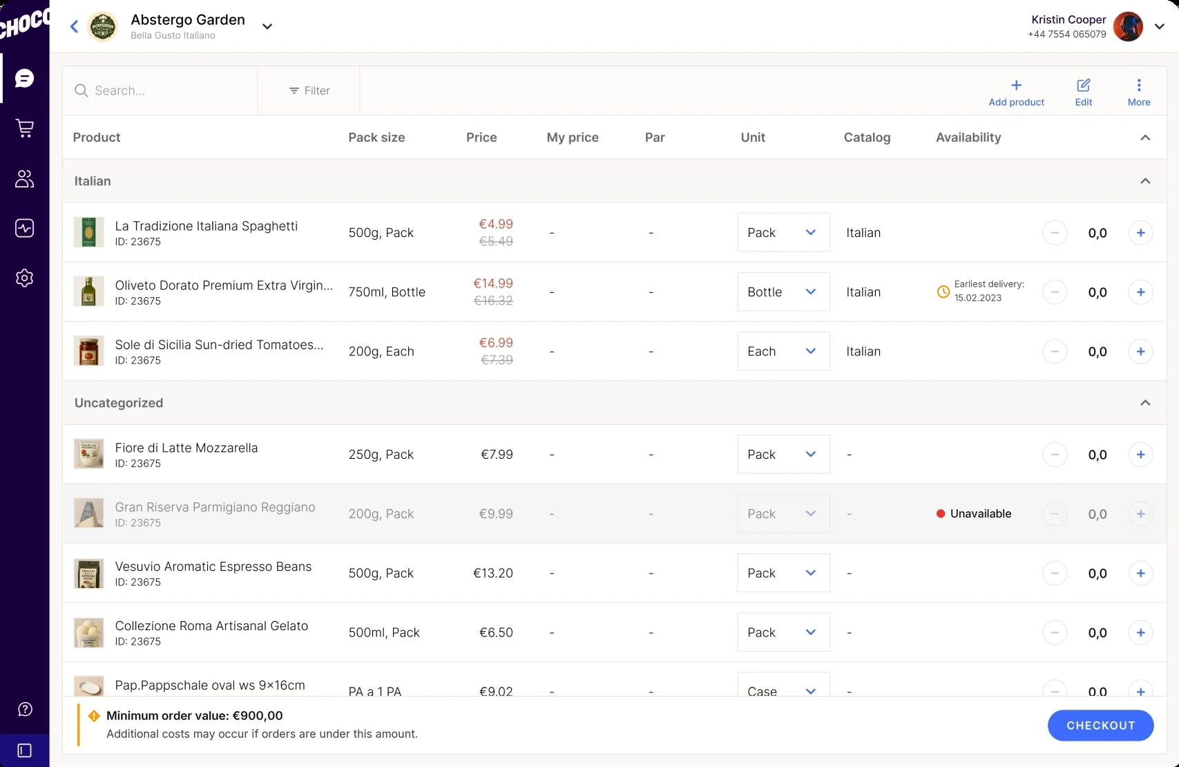
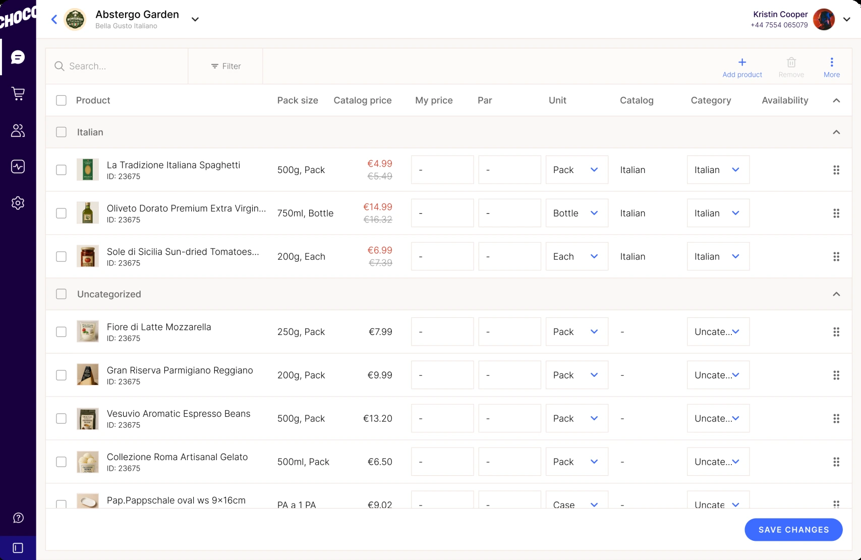
The result is a single tool with two modes:
- Order mode, shipped in July: a wider ordering table with images, search and filters, and with availability, lead time and cutoff time visible upfront.
- Edit mode, shipped in November: bulk updates to product lists across locations, so chains can manage everything from one place.
Switch between Order and Edit mode and hover over or tap a dot to see what changed, in both modes.
Outcome
| Goal | Result |
|---|---|
| Chains manage their own order guides | From daily change requests to operations, several a day from some chains, to none after Edit mode shipped |
| Ordering on web works for chains | Conversion from starting an order to placing it up 53.4% after Order mode launched, a relative increase |
Order growth was never a goal of this project. Orders had already been rising in spring as we onboarded more chains. In the first full month after Order mode launched, however, they rose by 169%, without any promotion.
- Nearly fivefold growth in four months: from 2,088 orders in July to 10,064 in November 2023
This result led to my appointment as design lead for the ordering redesign in December 2023. I was promoted to Lead Product Designer in May 2024.
| Month | Orders |
|---|---|
| March 2023 | 722 |
| April 2023 | 1,109 |
| May 2023 | 1,759 |
| June 2023 | 1,816 |
| July 2023 | 2,088 |
| August 2023 | 5,609 |
| September 2023 | 6,733 |
| October 2023 | 8,477 |
| November 2023 | 10,064 |
Reflection
- Look past the request. We were asked to build an editing tool. I recognized that the bigger problem was the ordering flow users struggled with every day, and made the case for fixing it within the same project. The growth followed that release.
- Trust is built by keeping scope tight. The PM gave me room because the additional work reused the same component and cost one week rather than a new project.
- Structure carries the result. The new screen was not a visual leap. The first release even shipped without the new navigation and our logo, and orders still grew nearly fivefold. What changed was the data underneath: the attributes buyers ranked highest, presented in the order they ranked them, in a table that holds up at scale.
There is more to this project than fits on one page.
Get in touchUp next
 Choco · Foodtech · Dec 2023 to Mar 20252023 to 2025