The problem
Choco is an app restaurants use to order from all of their suppliers. Because restaurants were used to ordering over WhatsApp, Choco had been built around its own chat: each supplier was a conversation, and every order started there. Ordering followed the logic of a paper order list. Buyers could only order from their order guide, and anything new required a detour through the catalog.
The guide also hid the information chefs need to make decisions: there were no images, units were unclear, and lead times and cutoffs appeared only late in the process. A single conflict could block the entire cart, so people often called their suppliers instead.
Choco also saw an opportunity for a second business: an ordering app that suppliers could offer to their own restaurants, under their own brand. However, nothing in the existing app could carry a supplier's brand, catalog or rules.
The challenge: a mirror, not a copy
In Choco, one restaurant orders from many suppliers. In white label, one supplier sells to many restaurants under its own brand. The features are the same, but the logic is reversed: search, catalog, checkout and promotions all behave differently depending on who owns the app.
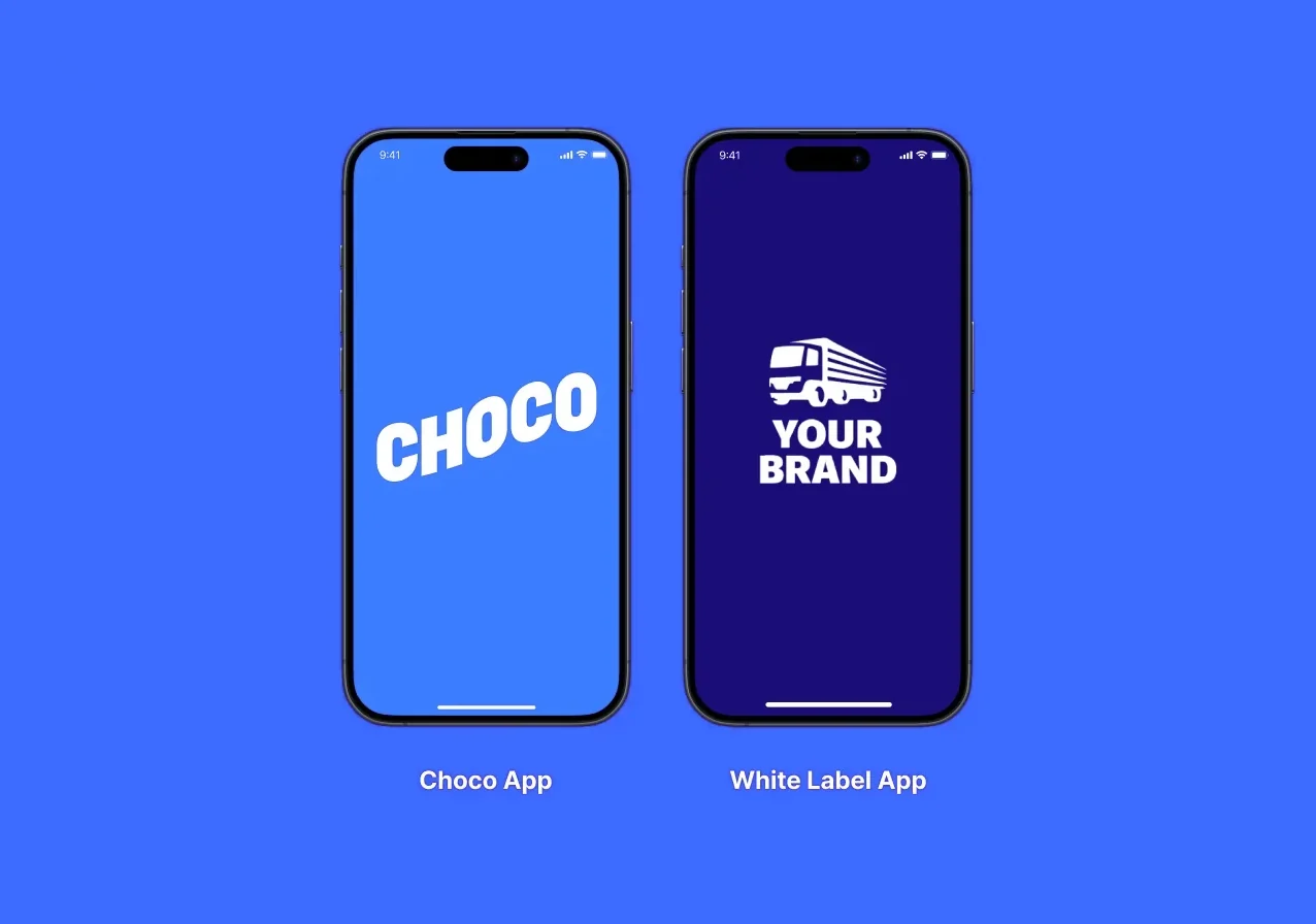
Engineering was rebuilding the app in Flutter, which gave us the chance to fix what had accumulated over the years, within the limits of the rebuild. The design team consisted of five designers, with no head of design and no research department. The central question was how five designers could rebuild an app that had taken three years to build, and turn it into two products at the same time.
Goals
For restaurants: trust the app enough to stop calling suppliers. Every order shows what is available and when it will arrive. Measured by completed orders and order errors.
For restaurants: order faster, from anywhere in the app. Buyers can order from any screen, not only from the guide. Measured by the number of steps to order.
For the platform: launch a new supplier brand without custom code. One Flutter codebase serves Choco and every white label app. Measured by the time to launch a brand and the number of custom forks.
For the team: one direction for the buyer side designers, so that an app which took three years to build could be rebuilt in about one. Measured by time to ship.
One frame for the buyer side
I led design for the buyer side, while another lead designer led the supplier side. I set the direction for ordering, which I also designed myself, and defined the patterns that the designers in onboarding, inventory and CRM built on.
One roadmap before any screens. Together with the PM, I ran a comparative analysis of ordering apps, ranging from Instacart and Wolt to Rekki. I then brought about 20 people from product, design and engineering into a single goals session, in which each participant described what success meant for their area. We turned the results into one delivery plan with clear milestones: MVP scope, team kickoff, design review with engineering, and usability testing. A pre mortem helped us identify the main risks early: one large release instead of phases, scope creep, users preferring the old way of ordering, and data migration. For this reason, we released in phases.
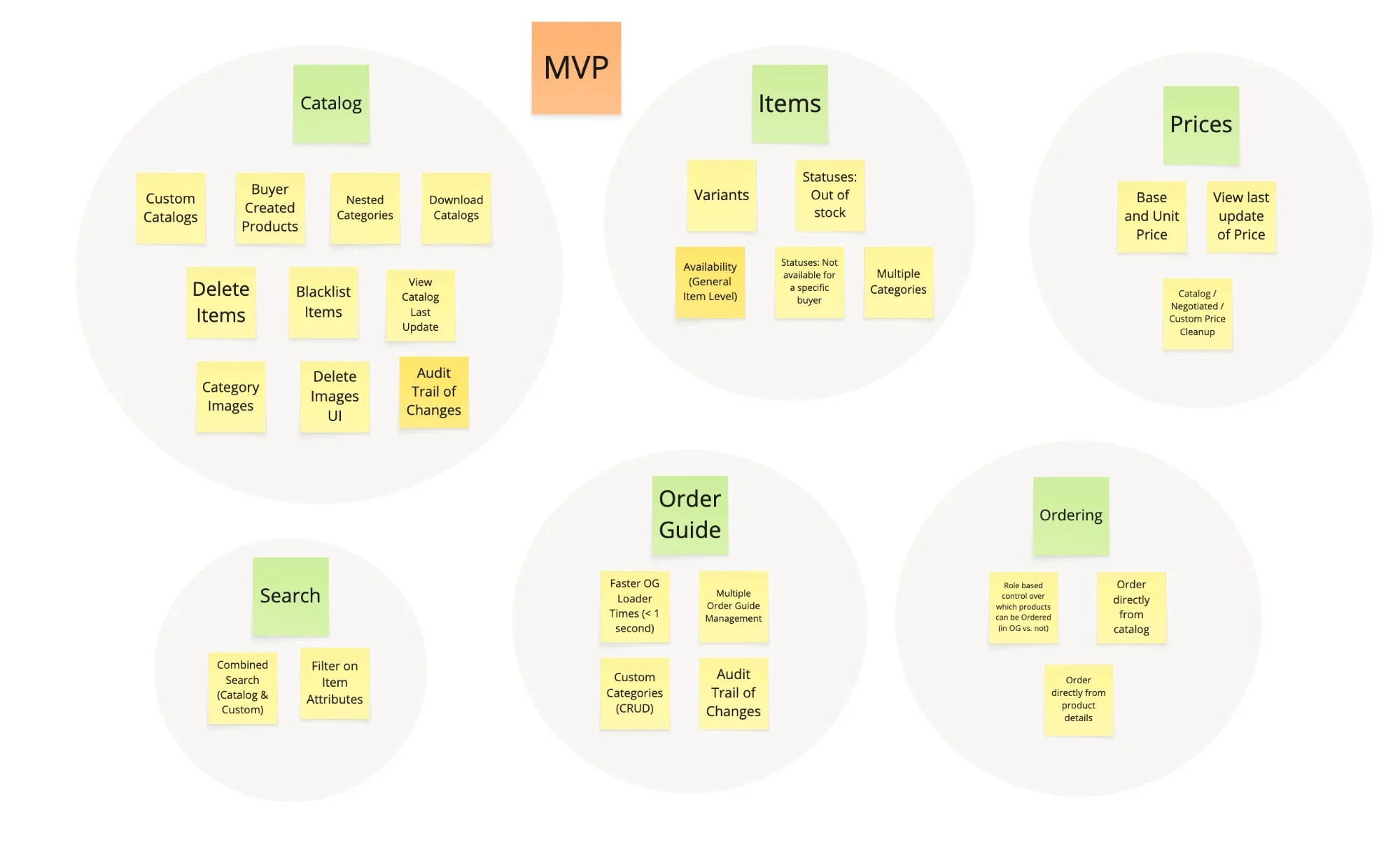
Lower the risk of the platform shift. We built the product details screen first, since a mistake there would cost the least. It proved that the team could ship in Flutter.
Direction is shared, decisions are local. Designers made decisions within their own teams, inside one shared frame. Silent critiques, a recorded demo tracker and team wide QA kept the work consistent. When the onboarding team built order guide scanning, for example, I decided where it should sit in the ordering flow, with a different placement for a first order than for returning buyers.
Testing without a research team. I set up reusable Maze templates and interview guides, so that every team could test its own flows.
Decision 1
One product cell for the whole app
I started this work before the rebuild began, and it became the foundation for everything that followed. The product cell appeared in nine places, from the catalog and order guide to order details and delivery check. I designed a single cell for all of them, with a clear hierarchy for name, price, unit and discount, square images, a compact picker that supports partial amounts and unit switching, and a running total that is always visible.
I tested the cell with colleagues, active chefs and first time users. New users completed their orders with a 100% success rate, but only 82% managed to change the unit, so we reworked the unit drawer. I also tested the cell with and without images, because the result would decide whether we invested in a product photo database. With images, people ordered faster and made fewer mistakes, so the images stayed.
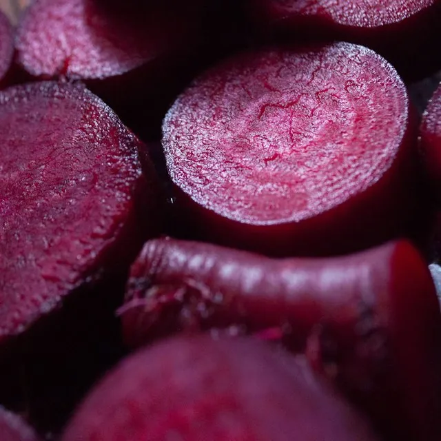
Toggle real ordering edge cases to see how the card handles each one.
Decision 2
Order from anywhere
I mapped the full ordering path of the live app in Miro. A first order took 14 steps, because buyers had to set up their order guide through the catalog before they could order anything, and every order started in the supplier chat.

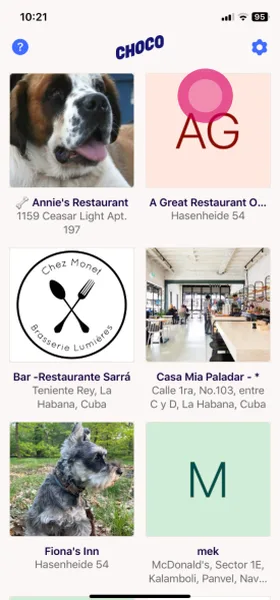
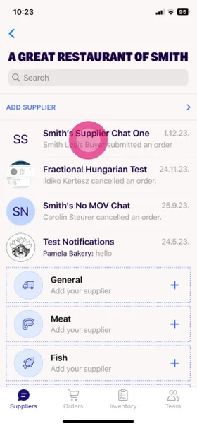
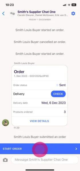
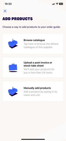
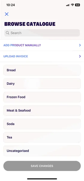
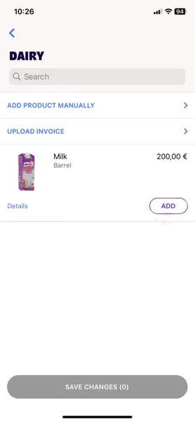
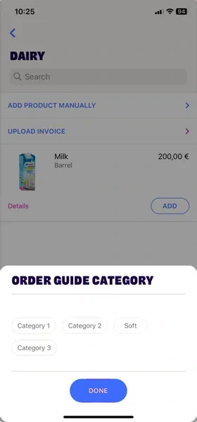
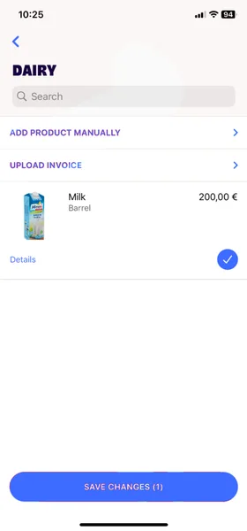
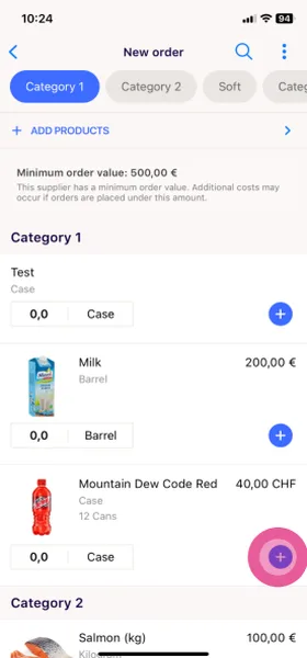
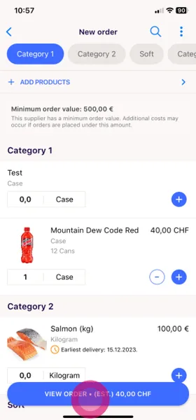
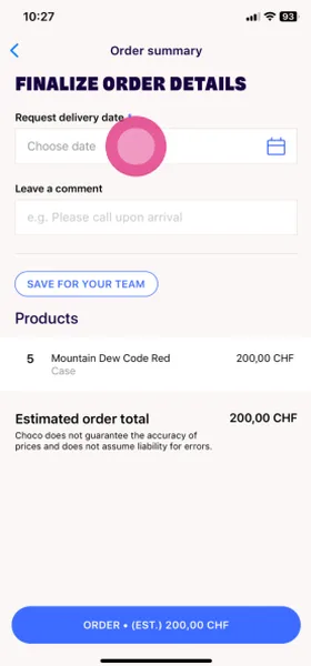
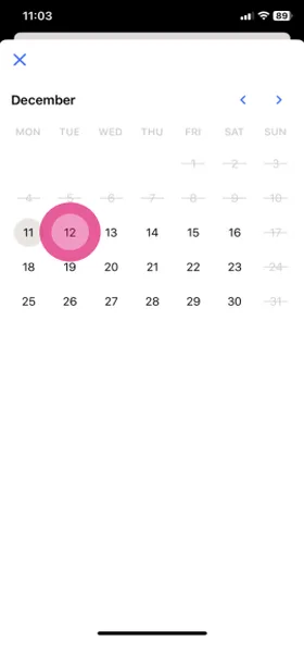
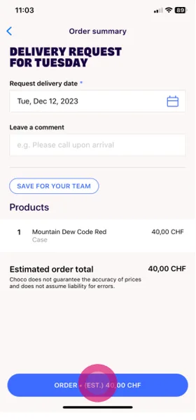
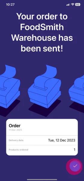
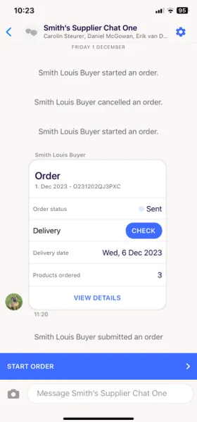
The setup was work we had handed to our users, and it stood between them and the one thing they came to do. My view was that the app should solve their problem instead of creating a new one, and that removing obvious friction would help them build a habit and trust the app. So instead of asking buyers to set up ordering first, I let them simply start ordering, and the setup builds itself from what they order. Buyers can order directly from the catalog and product details, which cut a first order from 14 steps to 9 and got new restaurants to their first order faster. The order guide became a favorites list, and one search covers both the guide and the catalog.
Ordering from the catalog changed how products and lists were stored, which some teams saw as a difficult change. Through research and prototypes, I got everyone on board, and we shipped it. I also proposed taking the chat out of the ordering path, which would have removed two more steps. The engineering effort would have delayed the release, so we shipped without it, though I still believe it is the right next step. Turning the guide into a favorites list raised a new question, how restaurants create and edit their order guides quickly, but that became a separate project.
Issues
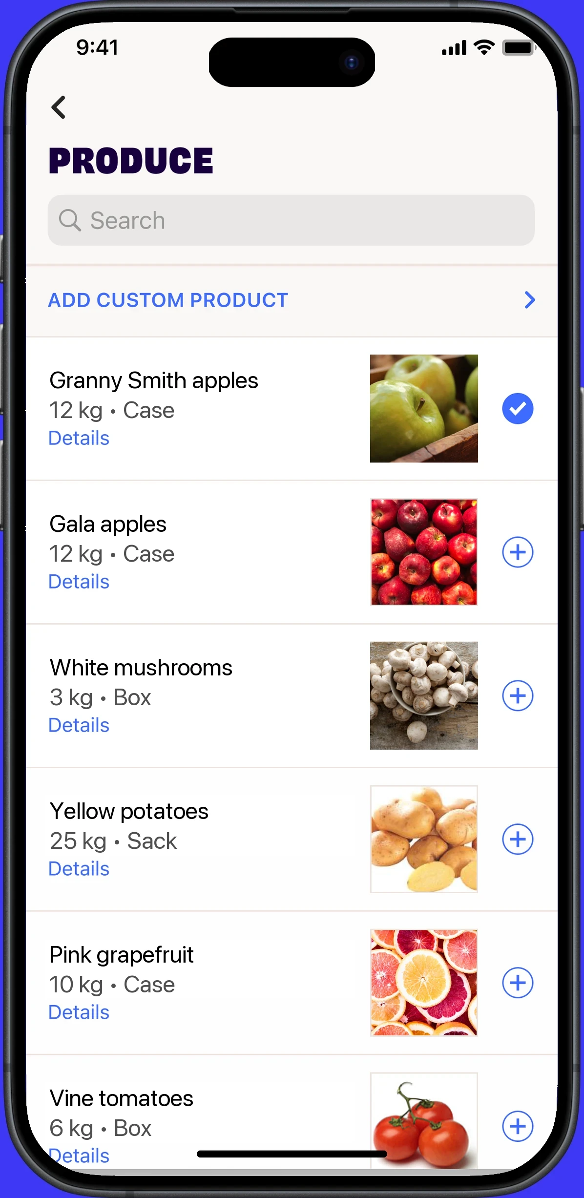
- No clear categories.
- Search covers the catalog only.
- “Add custom product” with no explanation.
- Only one action: add. The plus and check icons don't say what they do.
Issues
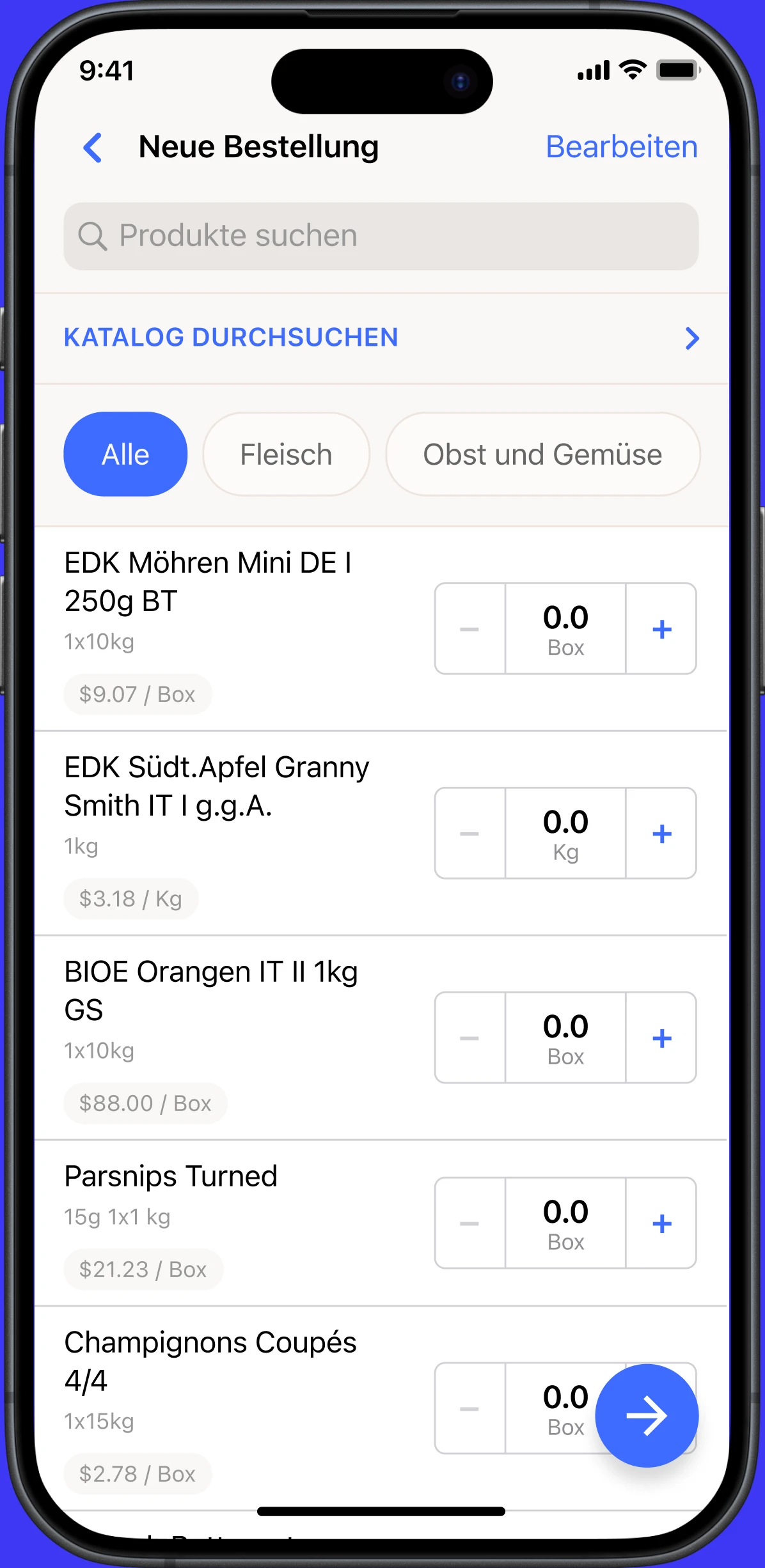
- Search covers the order guide only, not the catalog.
- Navigation, browse and edit take a lot of space for little value, so few products fit on screen.
- No product images, which slows visual scanning.
- Product names have a weak hierarchy, and secondary data blends into the layout.
- The picker takes too much space and can't change units.
- The checkout action at the bottom is under emphasized.
Issues
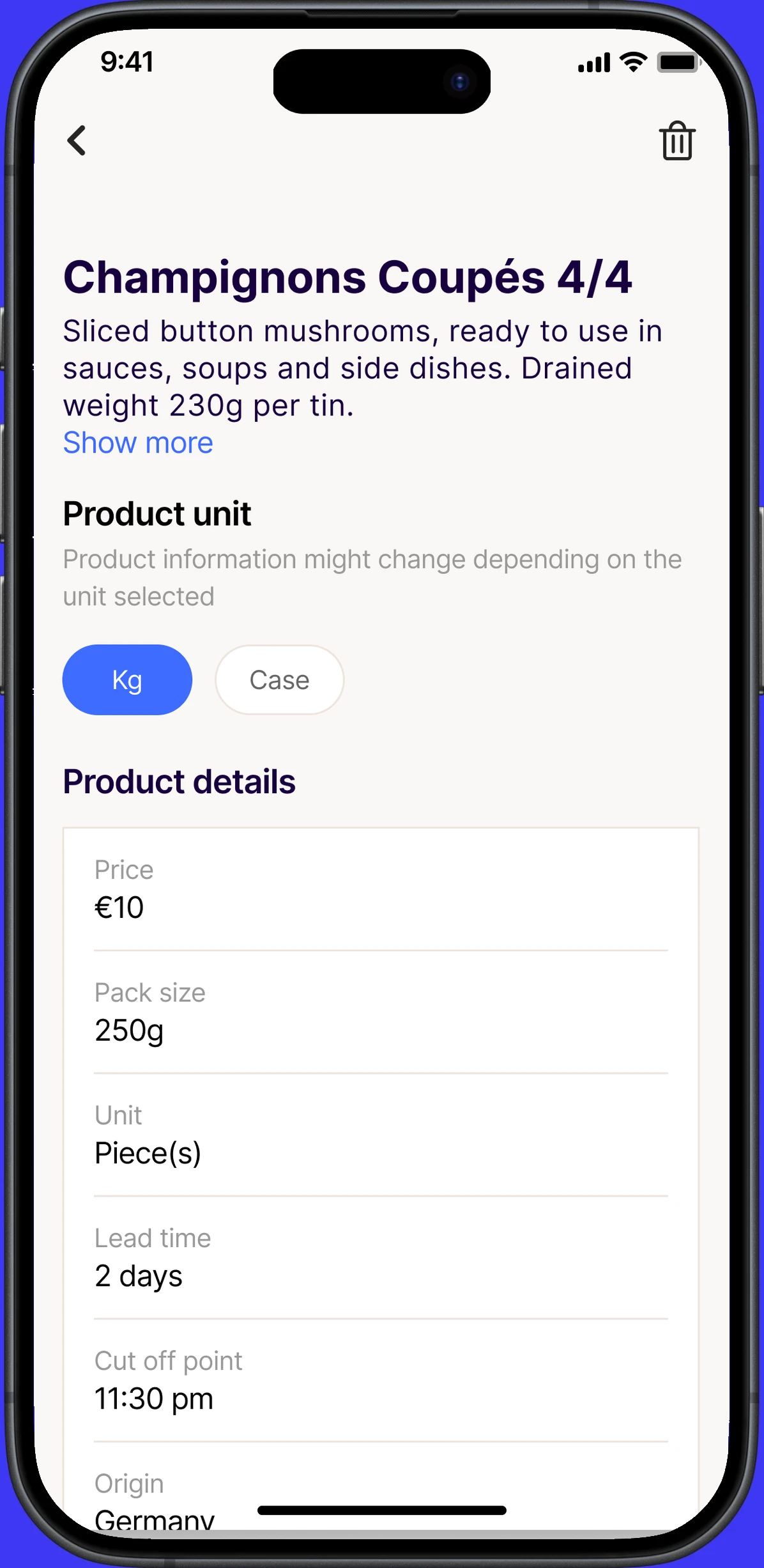
- Delete product, with no clear outcome.
- The unit variant switch is confusing.
- Product information is hard to scan.
Issues
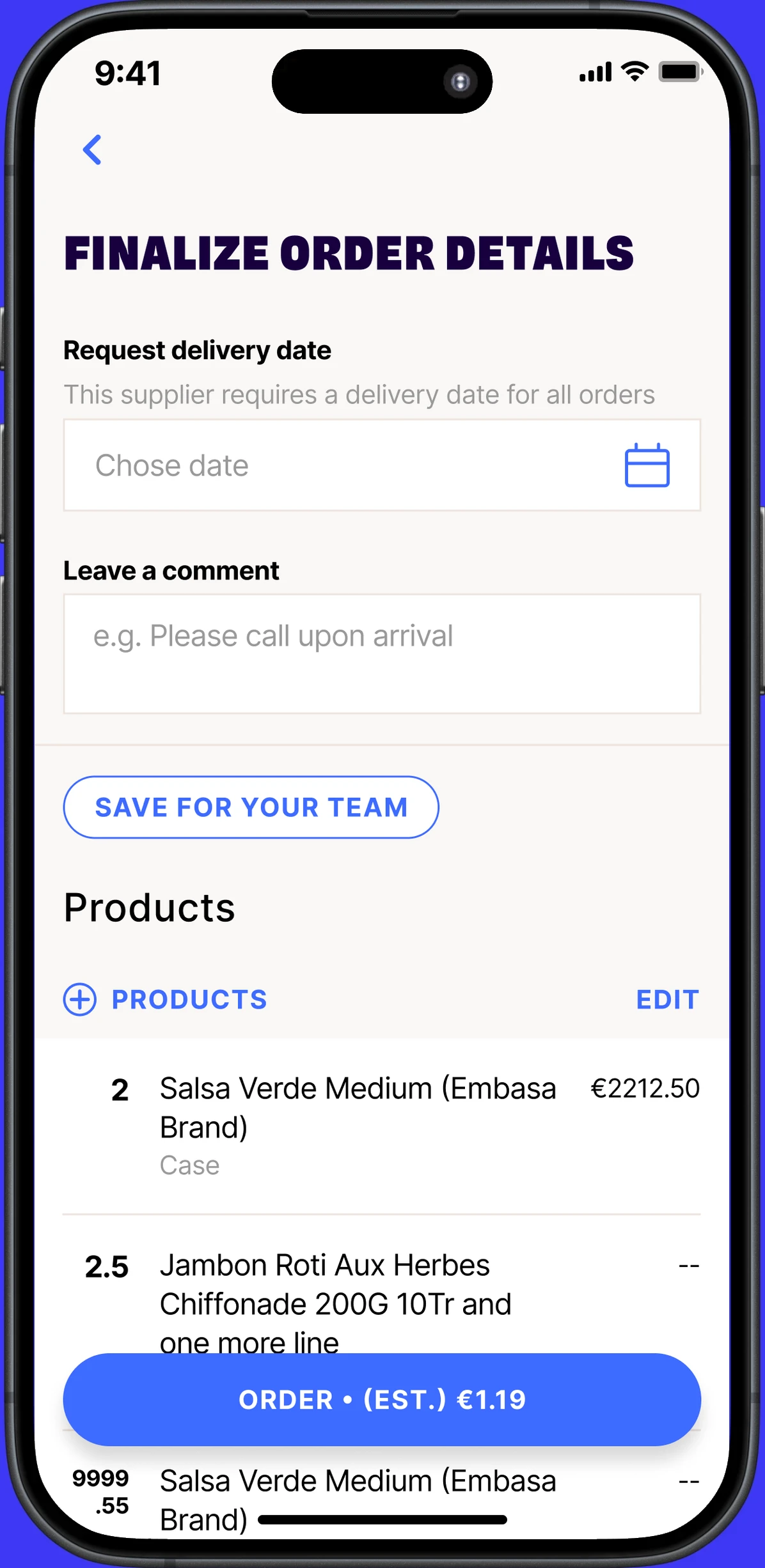
- Delivery date selection is hard to use.
- The supplier comment is buried.
- “Save for your team” starts a confusing flow.
Improvements
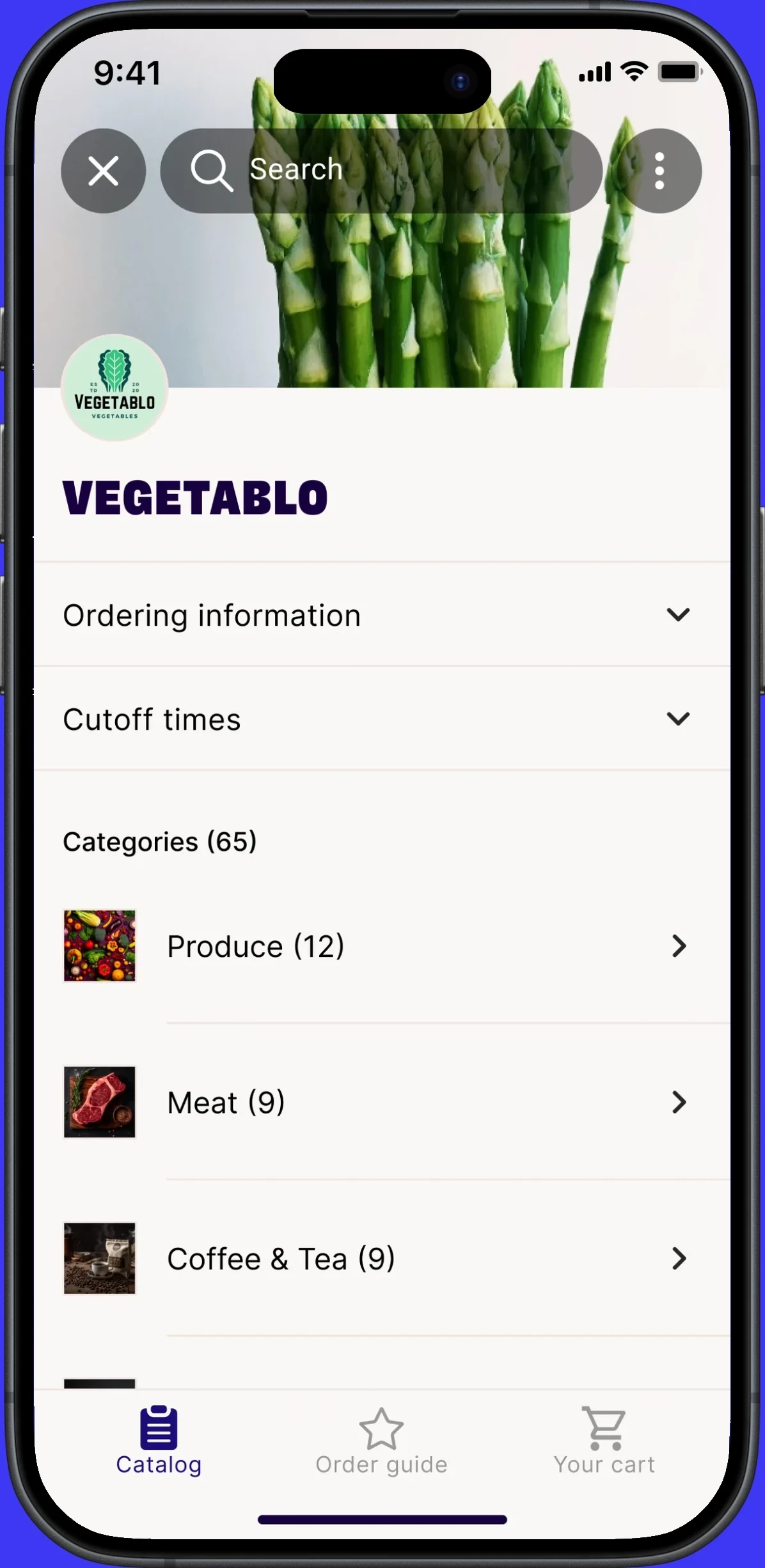
- One search across catalog and order guide.
- More actions for creating, editing and other features.
- Supplier logo and name, so you always know whose store you are in.
- Ordering and cutoff info at the top, expandable.
- Categories like Produce, Meat and Coffee.
- Order directly, or star to save to the order guide.
Improvements
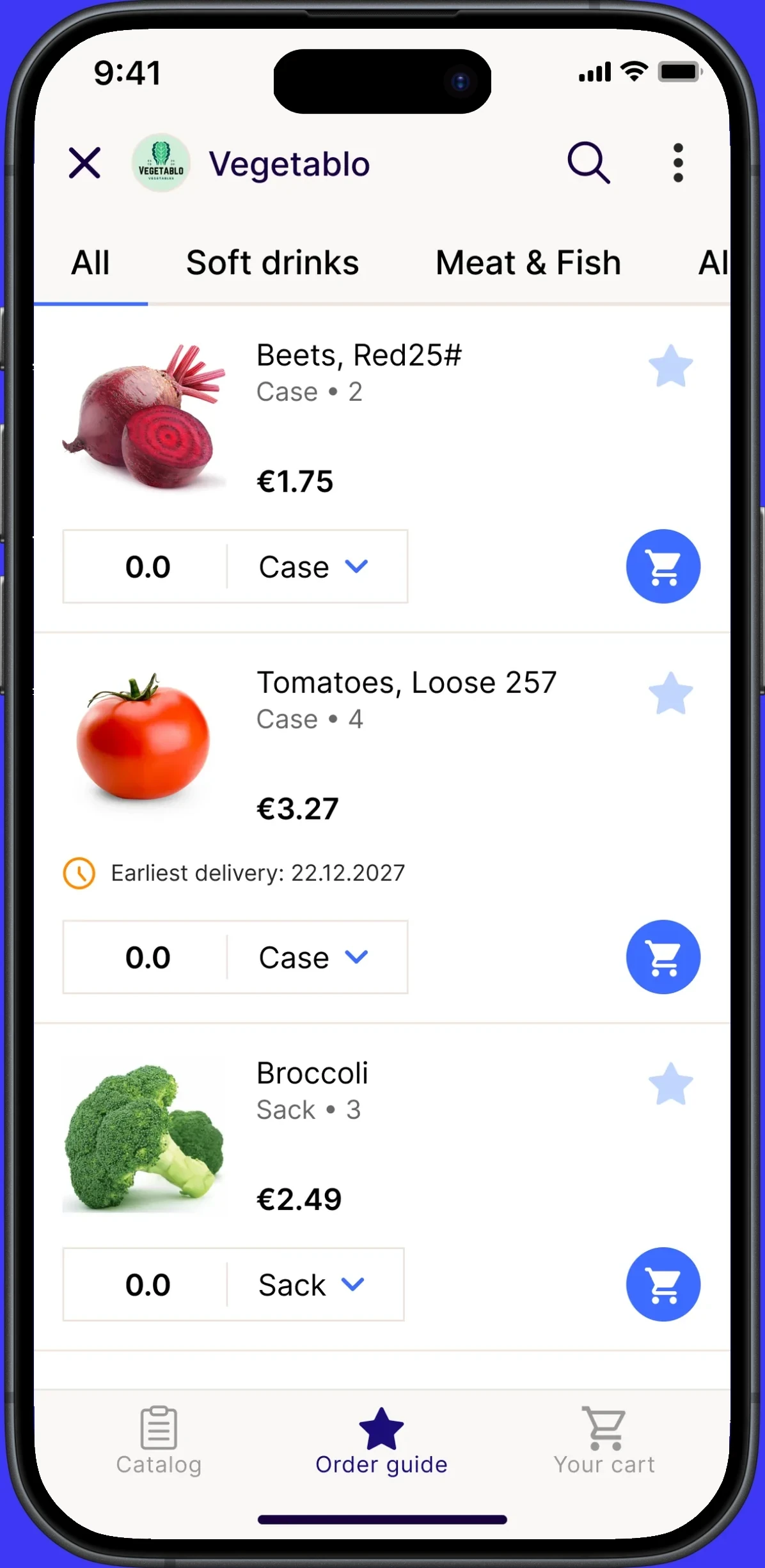
- Smaller header, more room for products.
- Easy to add to and remove from the order guide.
- Name, product details and price in a clear hierarchy.
- A compact picker with partial amounts and a unit switch.
- A cart icon replaces the plus, so star and cart mean different things.
- Earliest delivery, cutoff time, price and a square image on every product.
- Bottom navigation: move freely, cart always in view.
Improvements
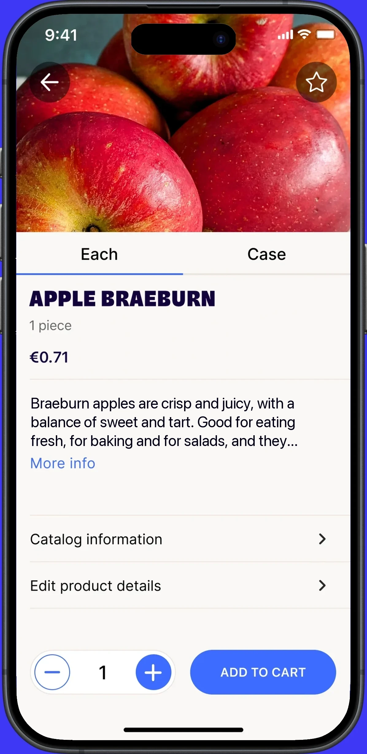
- Star to save the product to the order guide.
- Product image.
- Unit variants, with the picker on the page.
- Catalog information, editable.
- Edit product details, so you can change them if needed.
- Order straight from product details, with a picker and Add to cart.
Improvements
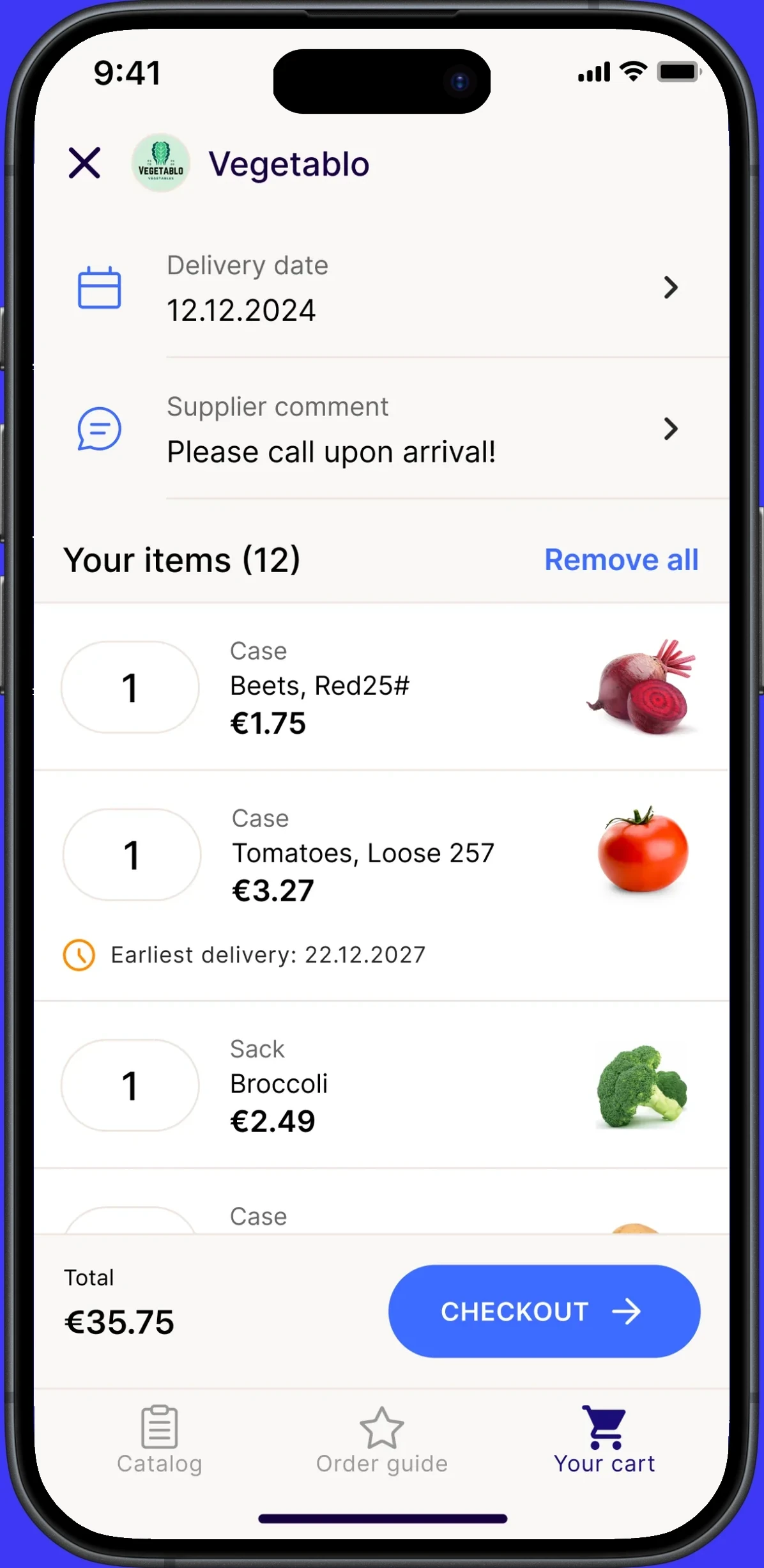
- Delivery info and supplier comment kept.
- Edit or remove products, so the manager only approves.
- Kebab menu for extra options, like custom items.
Decision 3
A cart that resolves conflicts
The old cart could not be edited, so a single product with a longer lead time or a missed cutoff blocked the entire order. I made the cart editable and showed lead time and cutoff for each product, so buyers can remove or move that one item and continue ordering.
With team orders, several people fill one cart, and the purchasing manager reviews, approves and sends the order. I mapped five roles against every action in ordering: admin, staff and contributor on the restaurant side, and supplier admin and sales rep on the supplier side.
Restaurant
Supplier
Runs the account: the catalog, the team and every order.
11 of 11 actions
Catalog
- Browse catalog
- Create / update custom products
- Edit product details
Team
- Add / remove members
- Edit team roles
Ordering
- Place single order
- Start, edit & add to team orders
- Cancel team order
- Submit team order
After the order
- Send messages
- Delivery check
Decision 4
One brand definition themes the whole app
No solution could be one size fits all, yet every custom fork would break the platform. I therefore defined a shared core that stays the same in every app, and a thin layer that each supplier can adapt: the brand, not the structure.
Beneath this sat the semantic color system. When that work stalled, I stepped in and shared the lead on it, defining the token structure and the rules for how a single brand color themes the entire app. The other designers tested it in their own flows and built on it. On top of this, I set up the process for launching a new brand. Previously, each brand was configured by hand, with images, colors and several rounds of back and forth with the supplier. Now the team sets the brand color and adds two assets, and the brand theme is ready the same day.
- 24 × 0.5 L€18.90 / Case0Case
- 1 × 1.2 kg€24.90 / Kg0Kg
- 1 × 10 kg€1.75 / Kg0Kg
- 6 × 0.75 L€47.40 / Case0Case
- ~4 kg€32.90 / Kg0Kg
- 10 × 250 g€21.90 / Tray0Tray
- 12 kg€21.40 / Case0Case
- 12 kg€19.80 / Case0Case
- 3 kg€8.40 / Box0Box
- 25 kg€14.50 / Sack0Sack
- 10 kg€16.90 / Case0Case
Browse catalog
Product unit
Product information might change depending on the unit selected
Product details
- Price
- Pack size
- Unit
- Lead time
- Cut off point
- Origin
Finalize order details
Request delivery date
This supplier requires a delivery date for all orders
Choose a delivery date to send the order.
Leave a comment
Products
Delivery date

Harbor LineNorthfield ProduceBrauMeister
Order by 5pm for delivery tomorrow.
Delivery days: M, T, W, T, F, S, S
Min order: €10.00 • Delivery fee: €5.99
- Monday17:00 Sun
- Tuesday17:00 Mon
- Wednesday17:00 Tue
- Thursday17:00 Wed
- Friday17:00 Thu
- Saturday17:00 Fri
- Sunday17:00 Sat
Categories (4)
![]()
![]()
![]() All products (65)
![]() Drinks (24)
![]()
![]()
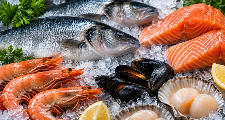
![]() Meat & Fish (9)
![]()
![]()
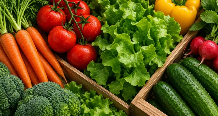
![]() Produce (12)





 Harbor LineNorthfield ProduceBrauMeister
- Case • 24€18.900.0Case
- Kg • 1.2€24.90
Earliest delivery: tomorrow
0.0Kg - Kg • 10€1.750.0Kg
Categories (3)
![]() Drinks (24)
![]()
![]()
![]() Meat & Fish (9)
![]()
![]()
![]() Produce (12)
- Pack size
- Origin
- Lead time
- Cutoff
Harbor LineNorthfield ProduceBrauMeisterReview order
Order summary


Delivery date
Supplier comment
Units
Actions
Outcome
| Goal | Result |
|---|---|
| Trust the app enough to stop calling suppliers | 72.8% → 80.2% completed orders in the product cell rollout pilot, and 60% fewer order errors in pilot testing, mainly around units and delivery dates |
| Order faster, from anywhere | 14 → 9 steps for a first order |
| Launch a new supplier brand without custom code | A new brand theme set up the same day instead of several days by hand, every white label app on the shared system |
| One direction for the buyer side designers | Nearly the whole app rebuilt in about a year |
Not yet: the chat as a tab in the bottom navigation, and advanced search.
Two areas behind these decisions are covered in separate articles: the error handling guidelines I created for every squad working on the ordering apps, and why supplier catalogs did not scale and what could replace them.
Reflection
- Fix the path before the screens. The structure determined the step count, and the screens followed from it.
- Lead through direction, not control. The designers sat in different squads, so a shared frame allowed each team to make decisions without waiting for review.
- Make the structural case with prototypes. Ordering from the catalog met resistance across teams. Research and a working prototype were what moved it forward.
There is more to this project than fits on one page.
Get in touchUp next
 Trade Republic · Fintech · Sep 20262026